Greenwich, Connecticut Registrar Uses Free Tool to Visualize Election Data
This story was featured in our ELECTricity newsletter in May 2017. Sign up to receive more success stories from election offices across the country. And how is your election office using technology to run excellent elections? Tell us about it by emailing [email protected] — we’d love to share your story!
In the last few years, election officials around the country have really started to embrace the use of data in their work. Whether they’re working with EAVS data, election results, or turnout statistics, officials are recognizing that they can use data that’s already at their fingertips to tell important stories about voting in their communities.
There’s a great example of this going on in Greenwich, Connecticut, where Registrar of Voters Fred DeCaro III is using a program called Tableau Public to create interactive data visualizations. Focusing specifically on registration data, he’s been working to create a picture — literally — of the local electorate.
“As in any field,” explains Fred, “people learn in different ways. Visualizations help portray the data in a new form which is more accessible to some people.”
Responding to a need
The town of Greenwich is home to just over 37,000 registered voters. A long-established bedroom community for many who work in New York City, Greenwich has 4 train stations to help commuters get around easily. The town’s Voter Registration department has 1 Democratic and 1 Republican Registrar as well as 2 full-time assistants. Working together, they administer 12 voting districts and 1 same-day voter registration location.

For years, Fred has understood how important voter registration statistics are to local stakeholders, whether they’re candidates, local media representatives, political parties, or just curious citizens. In the past, the department would respond to requests for registration data by sending a simple document either via email or even fax machine.
Needless to say, this old method came with drawbacks. Fred and his colleagues had to reply to each request individually. Plus, the documents they provided were pretty basic — just registration numbers separated by party and district and then organized into tables.
Fred realized that if the department could just make the registration data available on their website in a simple and useful format, there would be no need for people to contact the office to request it. “People always appreciate when reports are available online and on demand,” he acknowledges.
Creating interactive graphics
Initially, Fred had planned to just publish a simple table of the data on the department website. But two of Fred’s colleagues, Tom Klein and Jake Ellis of the Information Technology department, suggested using Tableau Public to make the data more usable and dynamic.
Tableau is a data analytics and visualization program with an incredible number of functions and features. Tableau Public is a free version of Tableau, and although it lacks some of the bells and whistles of the paid version, it still has plenty of functionality for an election official looking to make some basic data visualizations.
Fred gives credit to Jake for setting up the necessary Tableau Public infrastructure. “Jake did all of the heavy lifting,” he explains, “including building the dashboards. I basically drew some sketches, and he made it come alive.”
Using Tableau Public, the basic steps are to create a free account, upload your data, and establish settings to display your data in a clear and meaningful way. You can upload data with Excel spreadsheets, or you can connect Tableau to Google Sheets.
Once their visualizations were ready, Fred and Jake created a new Voter Registration Statistics website to host them. The site includes 4 charts and 1 table, all of which Jake and Fred created with Tableau Public.
The table is basic. Just a collection of numbers, it’s essentially the same document that the Voter Registration department used to send out via email and fax.
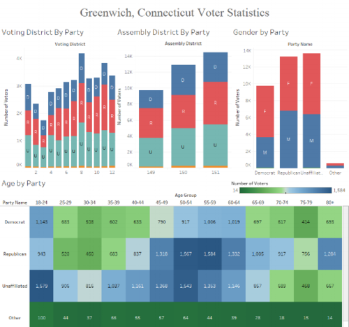
It’s the charts that are much more special. Instead of just being static images, they’re dynamic and interactive. Making selections in one chart impacts the others, highlighting just the piece of information you’re curious about.
Fred likes this interactive aspect the most. “More important than the visualization itself was the ability to make it interactive,” he says. “To click on a particular segment of data and have all of the other graphs adjust to just show data for that particular segment is powerful. That’s an instant query which might have taken someone 10 or more minutes to calculate.”
To help visitors to the site, Fred even created an 8-minute video that shows how people can use the graphs to find the answers to questions about Greenwich’s registered voters.
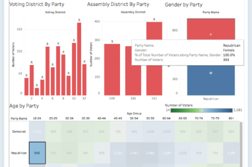
For instance, with a few clicks, you can find the number of women under 25 who are registered Republicans. By making just a few different selections, you can instead display the number of unaffiliated registered voters in a given district.
Hearing back from the public
So far, Fred says, people seem to really like the interactive voter registration visualizations.
“The response has been overwhelmingly positive,” Fred reports. “Tableau reduces the need for people to crunch their own numbers, since a few clicks will answer many questions. Plus, the political parties have shown interest in the data because they can see which age groups and genders they are making relative headway with in terms of party registration.”
Who’s the intended audience for the data? According to Fred, the audience is anybody who’s interested in it. In fact, he believes that making more and more data available can expand the group of people who might use it.
Breaking down the registered population by district and party was obviously important, but Fred felt that adding gender and age “would provide any social scientist or political junkie with extra value.”

Moving forward, Fred hopes to see more and more people use the registration data, and he has further ambitions for visualizing data.
Sharing more election data
In addition to working with historical registration data to show how the local electorate has changed over the years, he hopes to use data to help avoid waits at the polls. “I can see where some of the data we have on polling place usage could be visualized to help people realize when lines will be shorter at the polls,” he explains.
Fred encourages any election administrators who are considering using Tableau Public to experiment with it but also to take their time.
“Be patient,” he advises. “You won’t learn Tableau Public in 2 hours. Stick with it and ask for help from your IT department or others who might have experience with the program. Once you’re familiar with how Tableau works, you’ll be able to produce valuable information for your community.”
If you’re new to visualizing data, a good place to get started is this “Visualizing Data Effectively” video produced by the EAC and featuring representatives from the Center for Technology and Civic Life as well as Democracy Works. In addition, we hope to add more data tutorials to ElectionTools.org, so stay tuned for additional details.
If you’re curious about how other election offices are visualizing their data, check out these examples — each of which takes a slightly different approach:
What about you? What have you done with election data to better provide information to your community? Share your ideas with us by emailing [email protected].